|
I decided to make my presentation on PowerPoint. In order to answer the critical reflection questions, I included many pictures of my magazine and other things that had to do with what I was talking about, such as the type of audience, where my magazine will be distributed, and the websites I used to create my magazine. I talked about each slide through a voiceover. To make the voiceover, I made a voice memo of what I wanted to say for each slide. I then downloaded the audio onto my computer and put the audio in my PowerPoint. I had some issues with embedding the audio, so I decided to screen record my presentation, make it into an iMovie, and then upload the video to YouTube. I was then able to submit the link to the video to my teacher and put the link in my blog.
0 Comments
When doing my critical reflection writeup, I referred back to the critical reflection questions that I did throughout this course. Some of the critical reflection questions were weren't fully or properly answered, and they also lacked terminology. When doing this critical reflection writeup, I tried to improve my answers by going more in depth with my answers and using more terminology.
My product is a magazine about travel. My product uses conventions because it has certain aspects that most magazines do, such as a masthead, central image, cover lines, etc. However, my product also challenges conventions because it is made to be very clean and minimalistic, whereas most magazines are made to look very busy. My entire magazine maintains a clean and simple layout. The font of my entire magazine is in sans serif, meaning that there are no fancy feet, in order to fit the clean and simple look that my magazine is going for.
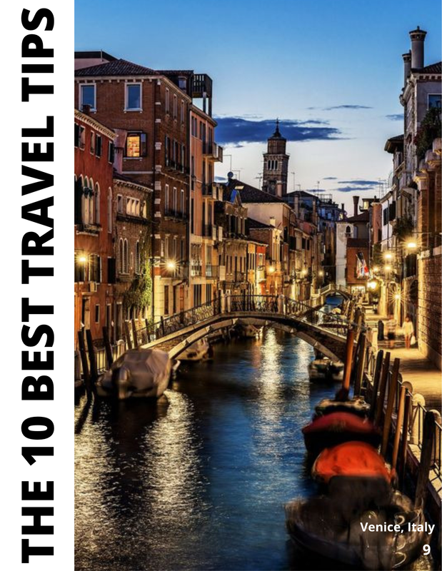
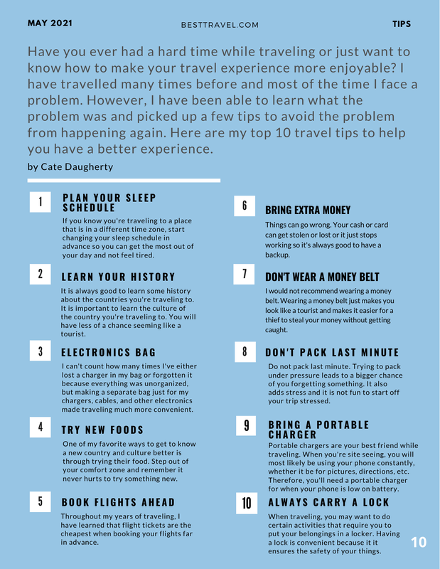
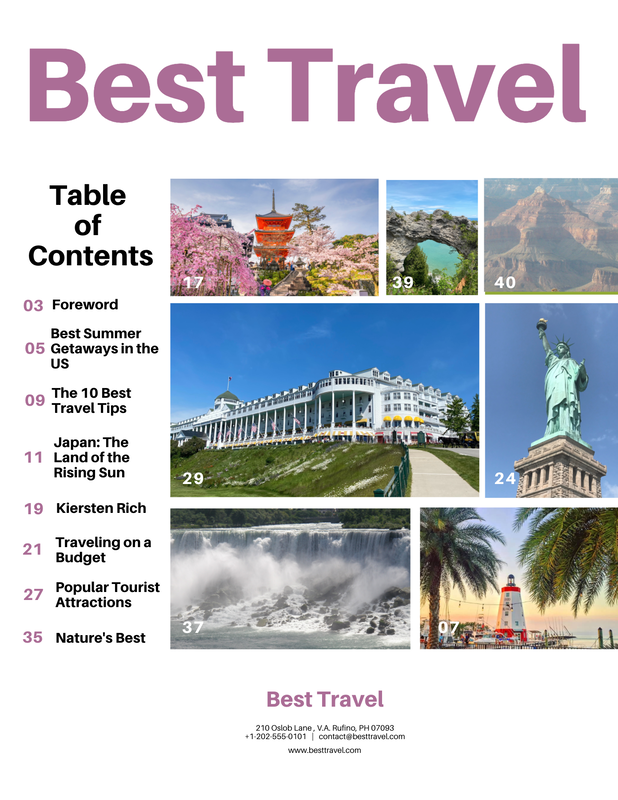
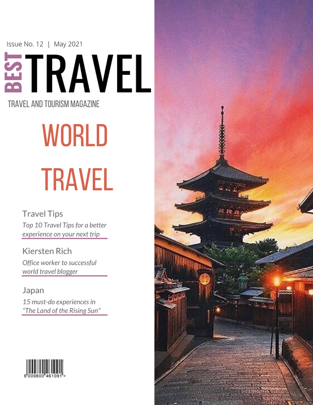
My magazine cover uses some conventions, but overall challenges conventions due to its minimalistic look. The masthead of my magazine is “Best Travel” in all capital letters which makes it clear to the audience that this is a magazine about travel. The word “Best” is in light purple to make it stand out and tie in the colors from the central image. My magazine deck is labeled “Travel and Tourism Magazine” in all capital letters, which helps make the audience more informed on what type of magazine Best Travel is. The issue number and date of my magazine is at the top, so the audience can easily find how recent this magazine issue was published. The main title of this magazine issue is “World Travel” because the contents in the magazine will contain articles about places all over the world. The words “World Travel” are in all capital letters and are in an orange color. They are the only words on the cover of my magazine that are in orange because I wanted them to stand out since it is the main cover. I chose the color orange because there are hints of orange in the central image. I have 3 cover lines with captions in order to give the audience an idea of what content this magazine consists of. The cover lines are in a column and are separated from each other by a light purple horizonal line in order to add color and make the cover lines clear. The central image is a picture in Kyoto, Japan which goes along with the cover line says, “Japan 15 must-do experiences in ‘The Land of the Rising Sun’”. There is also a barcode at the bottom of the cover. The table of contents for my magazine challenges conventions because it is made to look simple and manageable. At the top of my table of contents page is the masthead that says the name of my magazine which is “Best Travel” in big, light purple text which ties in the colors from the cover. I have the text on the left side of the page and a collage of pictures on the right side. The page numbers are in light purple text and the titles of the content are in black text. I also put a page number on each picture I used to make it easier for the reader to find the picture if it catches their eye. The contact information and location are at the bottom of the page. My magazine’s two-page layout uses conventions. For example, the first page has the title, which is “The 10 Best Travel Tips” in all capital, black letters, going down the left side of the page. There is a central image of Venice, Italy and a page number at the bottom. The second page has all the information, such as the introduction and the list. There’s also the publishing date, website of my magazine, and category for this page at the top of the second page. The list has two columns and is numbered. The tip is in big, bold text with a more in-depth description of the tip in smaller text underneath it. The background of the second page is simple since it’s a plain, light blue background. My magazine represents travelers since my magazine consists of information that travelers have gained from their experiences with traveling. My magazine helps the readers solve issues they may have with traveling. It also helps the readers have an overall better travel experience since they are reading about the recommendations and experiences from other travelers. My product engages with a large audience because traveling is very common and enjoyed my many people. People of all ages travel, whether it be long distance or short distance. However, certain articles in my magazine may attract a specific audience. For example, the article in my magazine that is about Japan would most likely engage with those who plan on traveling to Japan. My product would be distributed in grocery stores, gas stations, malls, airports, convenient stores, etc. There will also be an online copy on the Best Travel website. My magazine will be available in all countries because it deals with world travel. It will be released towards the summertime since the summer is a very popular time to travel. My production skills have improved a good amount throughout this project. Using Photopea to make my magazine cover helped me learn how to use a photoshop website. It was very challenging and confusing at first, but I was able to figure out the issue and what to do which I think helped improve my skills. Using Canva also helped my production skills. Seeing and being able to follow the different templates on Canva of more professional magazines allowed me to understand what I needed to do in order make my magazine look better. I was able to go back and improve my magazine cover as I went along which helped me gain more experience. During this project, I integrated many technologies to create this magazine. When first trying to decide what I wanted the topic of my magazine to be, I used Google to help me come up with ideas. I also used Google and Canva to look at templates and get inspiration for my magazine cover, table of contents, and double page spread. I used websites such as Photopea and Canva. I made the first and second draft of my magazine cover using Photopea. Then for my completed magazine cover I used Canva. I also used Canva to create my table of contents and two-page spread. Photopea and Canva taught me the basics of photoshop. The hardware I used was my MacBook Air. This is my completed 2 page layout. I changed the color of the background of the second page to match the rest of the magazine better. I added page numbers to the bottom of each page. I also moved the title "The 10 Best Travel Tips" from the second page to the first page because I thought the first page of spread needed some text. I changed the picture on the first page to a single picture of Venice, Italy because I thought it looked cleaner than the collage of pictures I had when I did my first draft of the 2 page layout.
Picture Source: https://www.harpersbazaar.com/culture/travel-dining/g7171/most-beautiful-places-in-the-world/ This is my completed table of contents. I changed some of the titles that are listed and some of the page numbers. I also changed the color of the text to match the magazine cover. All of the pictures I used are my own pictures except for one.
Picture Source: https://www.shutterstock.com/g/f11photo This is my completed magazine cover. My magazine is called Best Travel, and it is a travel and tourism magazine. This issue was released in May 2021. It is very different from the first drafts of my cover. I changed the layout and the title of this month's issue from "30 Summer Getaways" to "World Travel." I changed the color of some of the words to match the picture. I also changed the cover lines and the picture. The picture is of Kyoto, Japan.
Picture Source: https://www.instagram.com/p/Bljke7FFVc2/?epik=dj0yJnU9TVFyZFdLUHI0bzJ4X29CRU5JMnNHMW5IZGRCN0l5MU8mcD0wJm49cGhOU2M3N0ZPVlQ3UEpycmJLUjBXQSZ0PUFBQUFBR0JuaWJV |